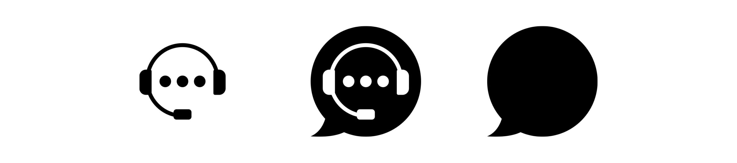
Being an AI start-up, it was inevitable that the client supplied me with a collection of logos generated by AI as a starting point. I have taken some of these ideas – the dot-dot-dot of instant messaging, the speech bubble, and an actual robot head wearing a headset (!?) – and created something simple and clean. Keeping the design clean allows for greater versatility across various applications.
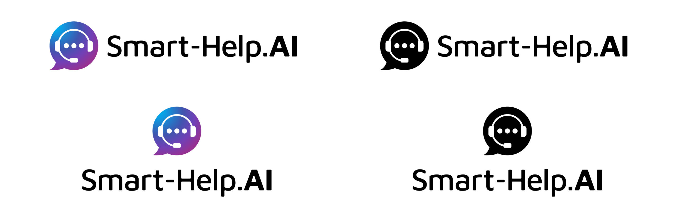
Using the actual URL as the logotype could benefit a web-based company as the logo gives an instant prompt to find out more information – you are removing a step in the enquiry phase for the customer. Using both a stacked version, and a linear version of the logo allows for greater versatility for multiple applications.
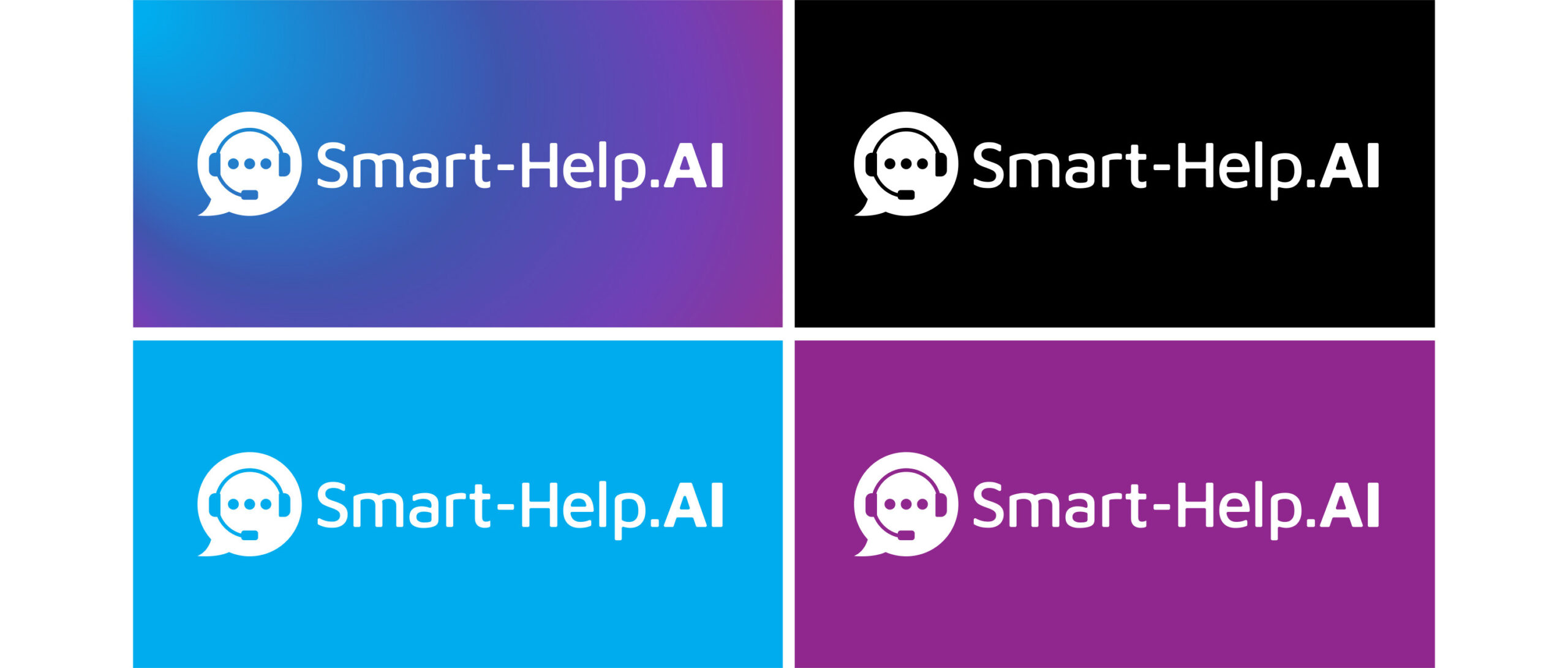
A reversed version of the logo and a primary colour palette.
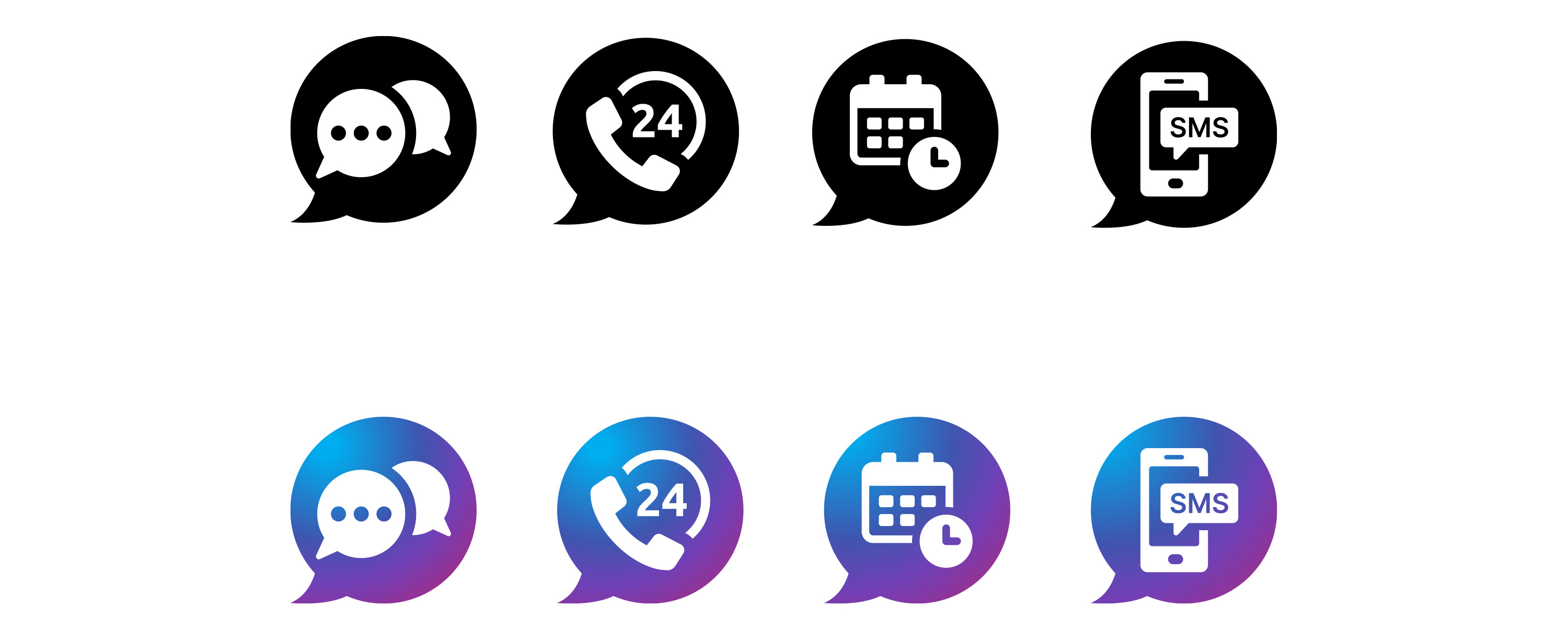
Secondary Icons – The speech bubble is a nice visual element that can be used to create other icons in order to develop a visual language for the brand. These secondary icons can define the drilled-down areas of the business.
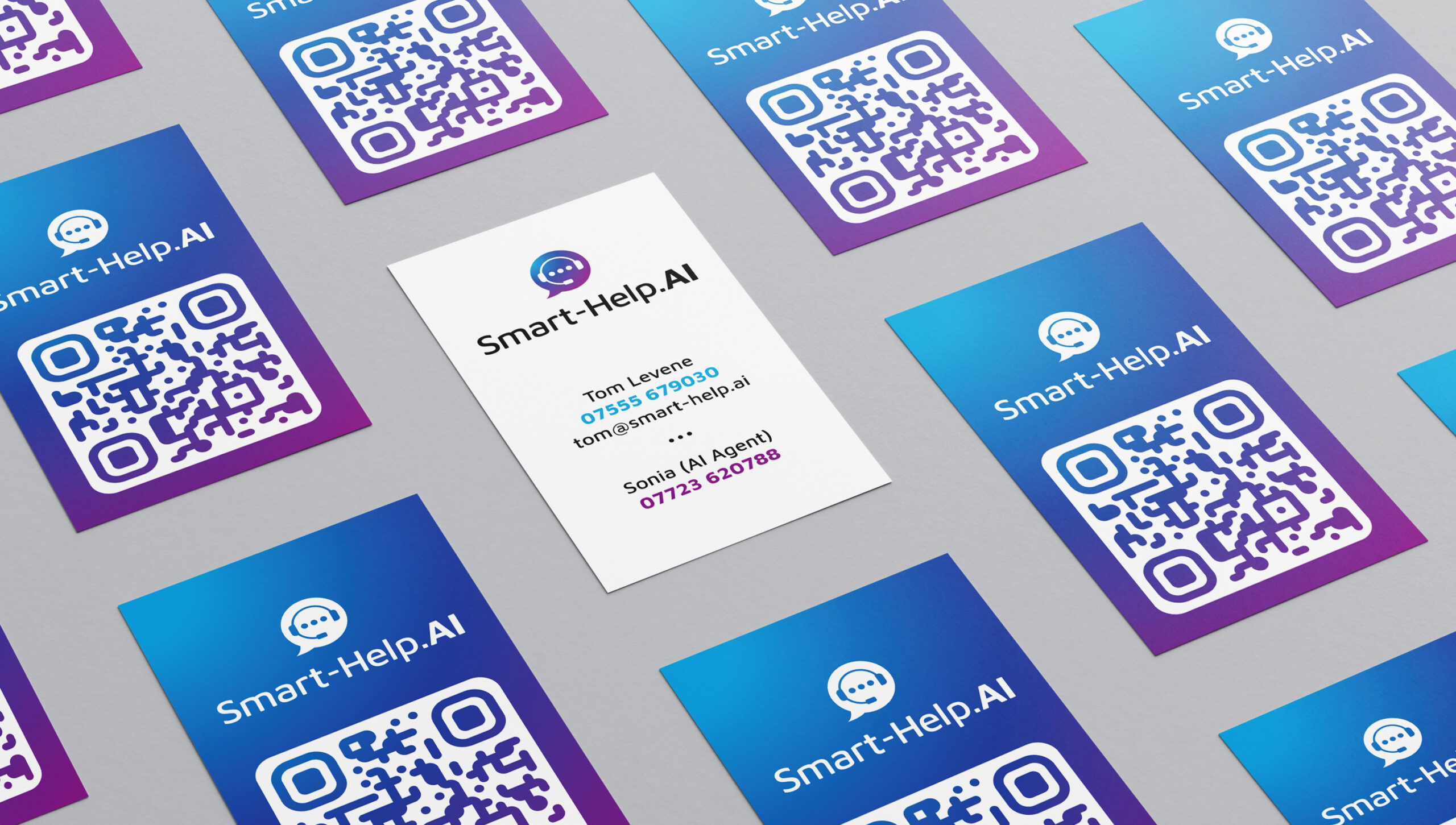
Business Card Design – Multiple applications of the brand are present on the business card, including a direct link to the website via QR.