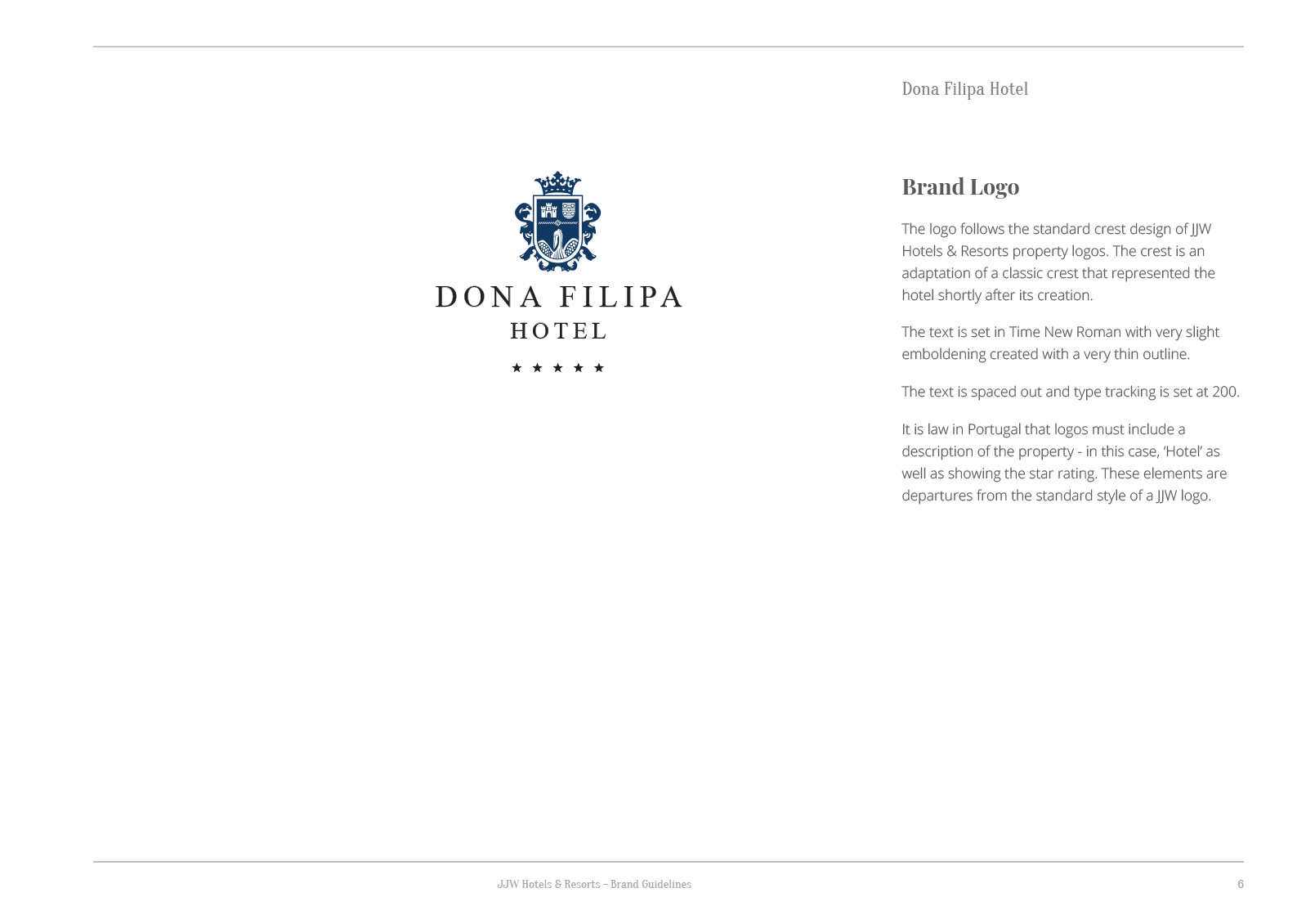
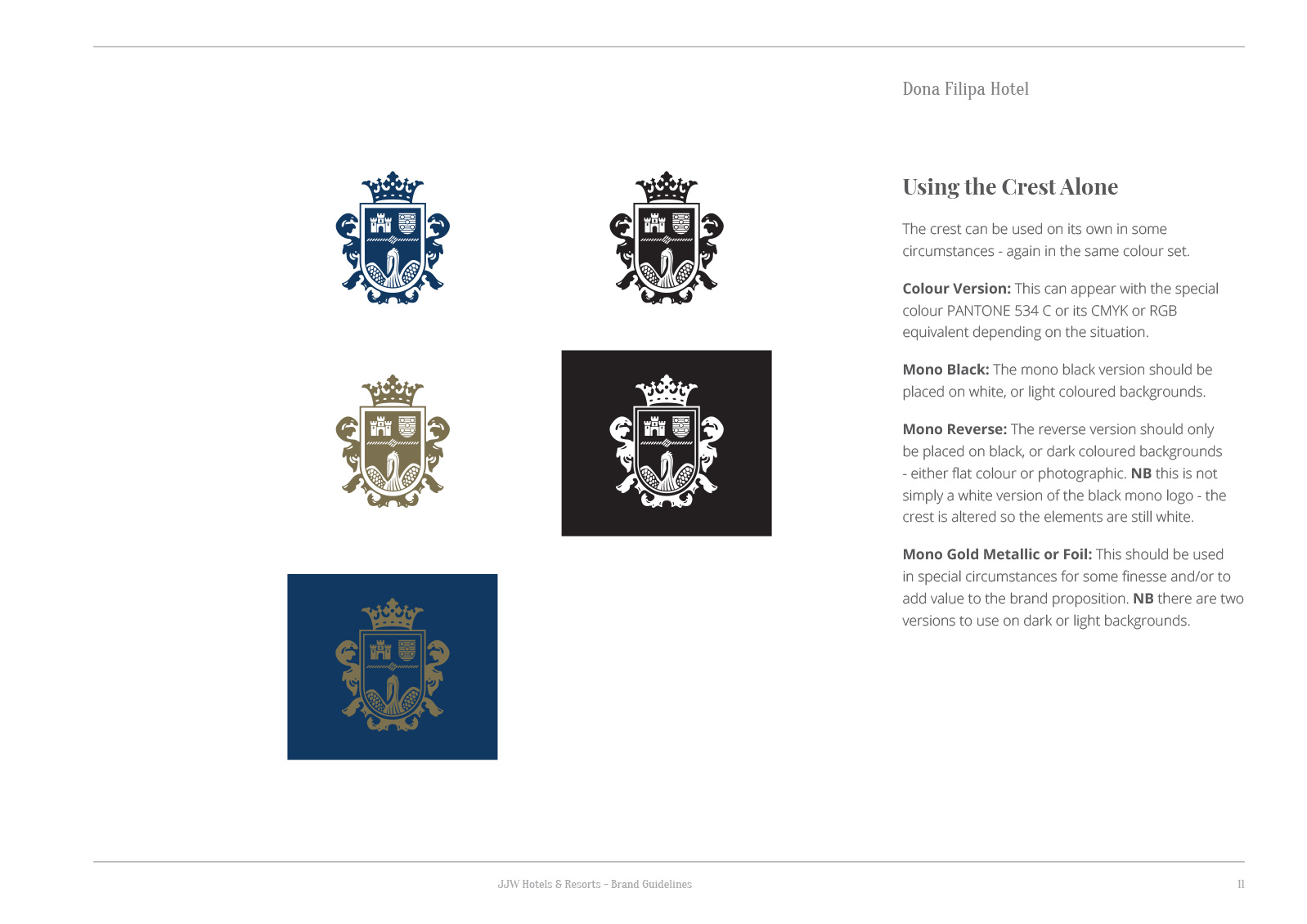
I created a new logo for Dona Filipa Hotel in Vale do Lobo, Algarve. The main inspiration was the royal roots of the historical figure the hotel is named after. I created an heraldic coat of arms to emphasise this history, as well as tie the identity in with other hotels in the group. The crest features a crown to display the royal connection and a pelican to represent nurture and protection.
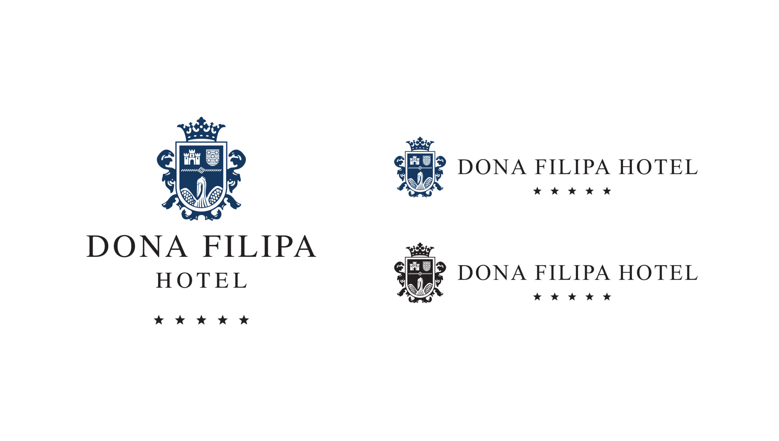
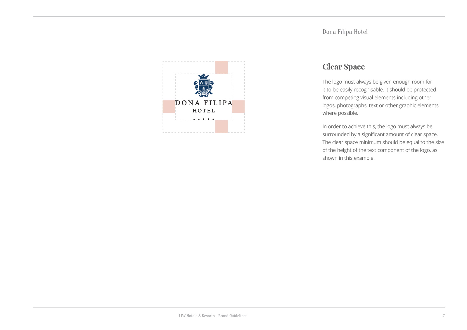
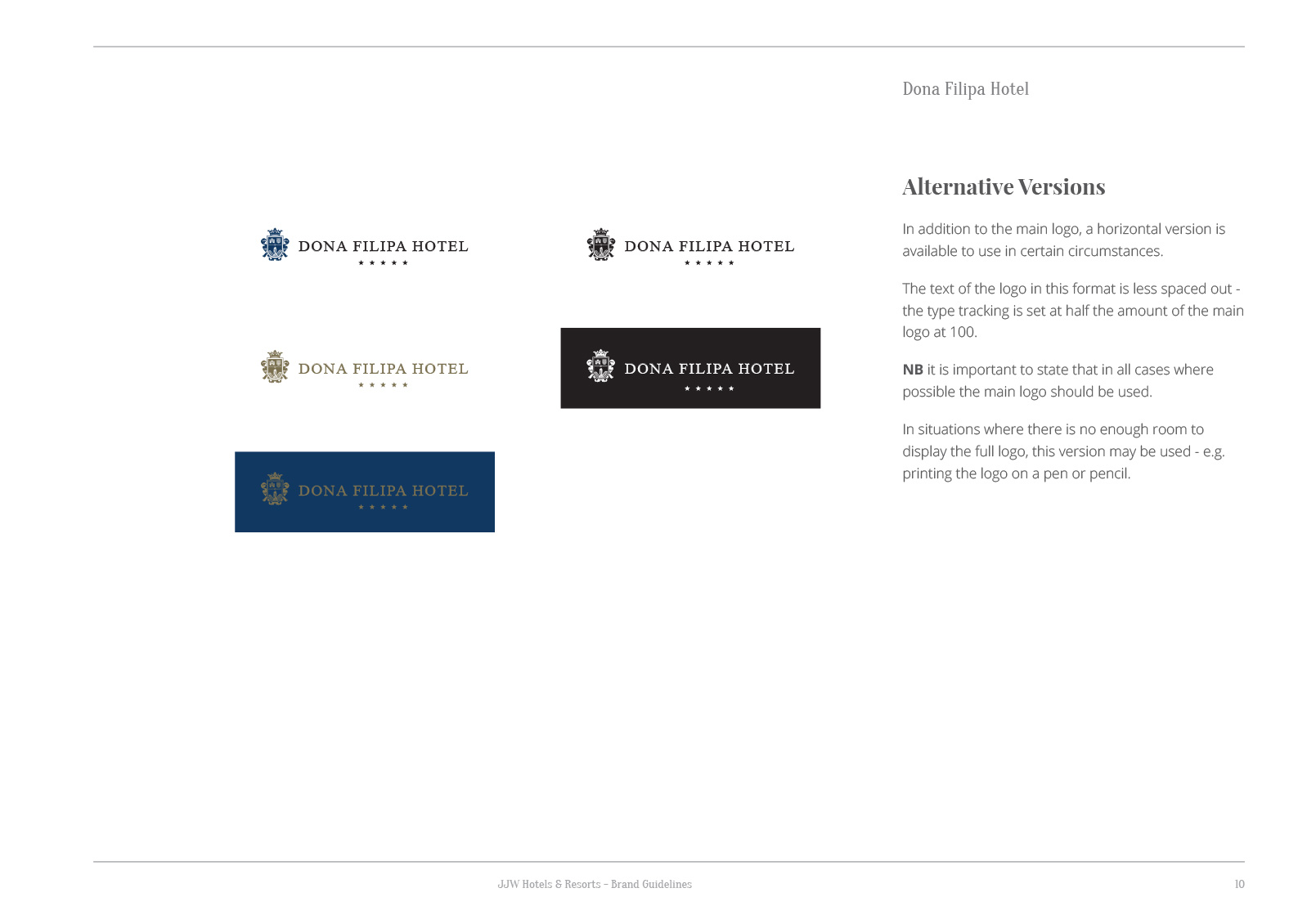
The logo was developed to work as a linear logo as well as a stacked version – this allows for greater versatility within the brand guidelines.
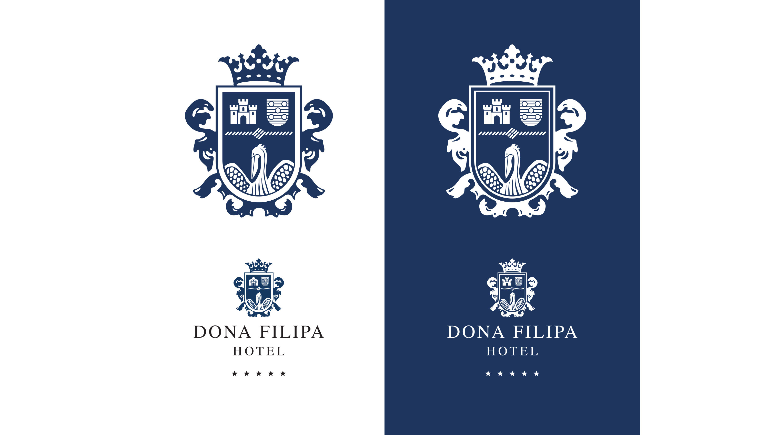
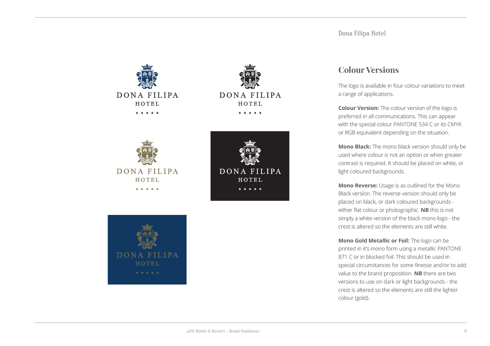
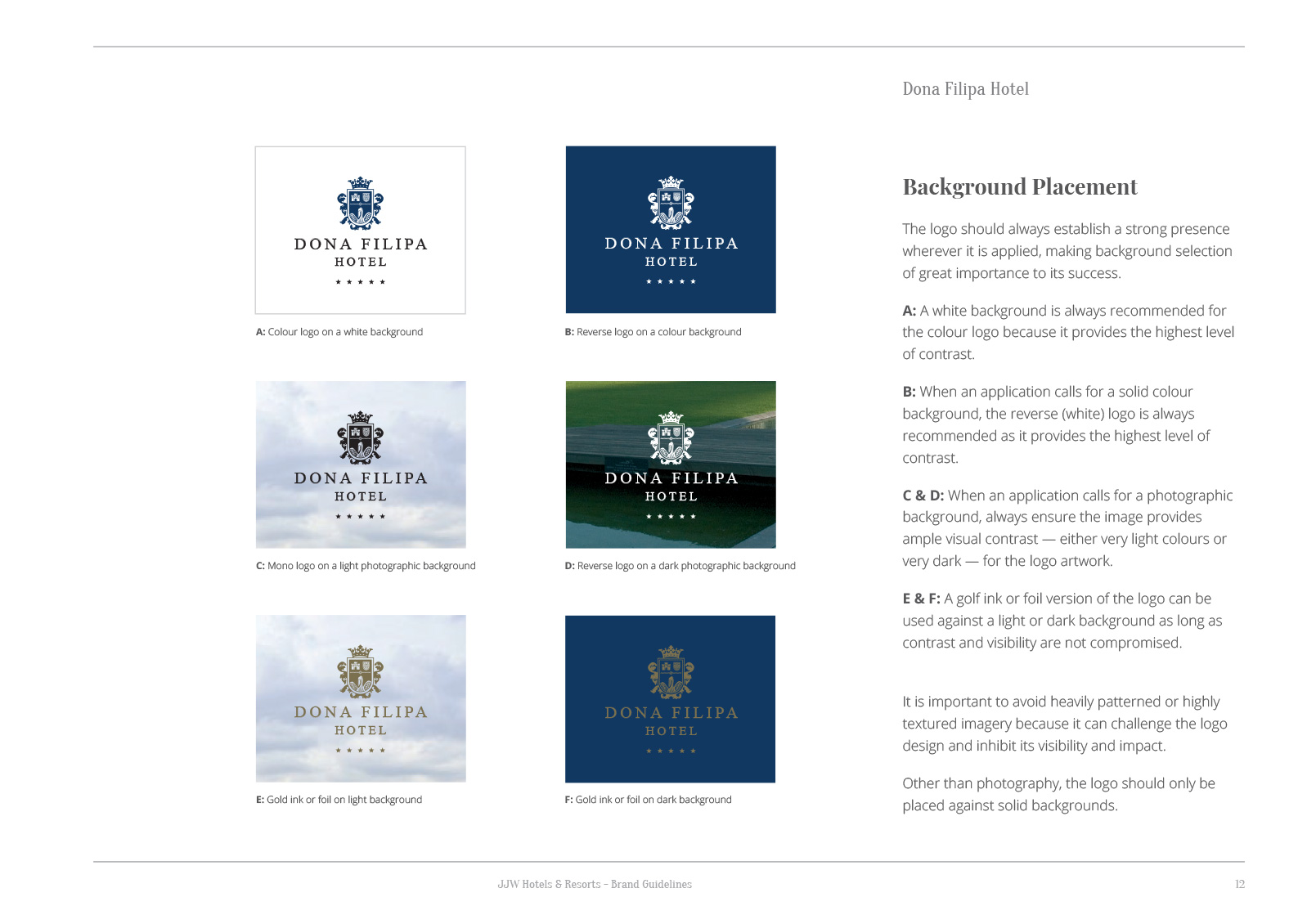
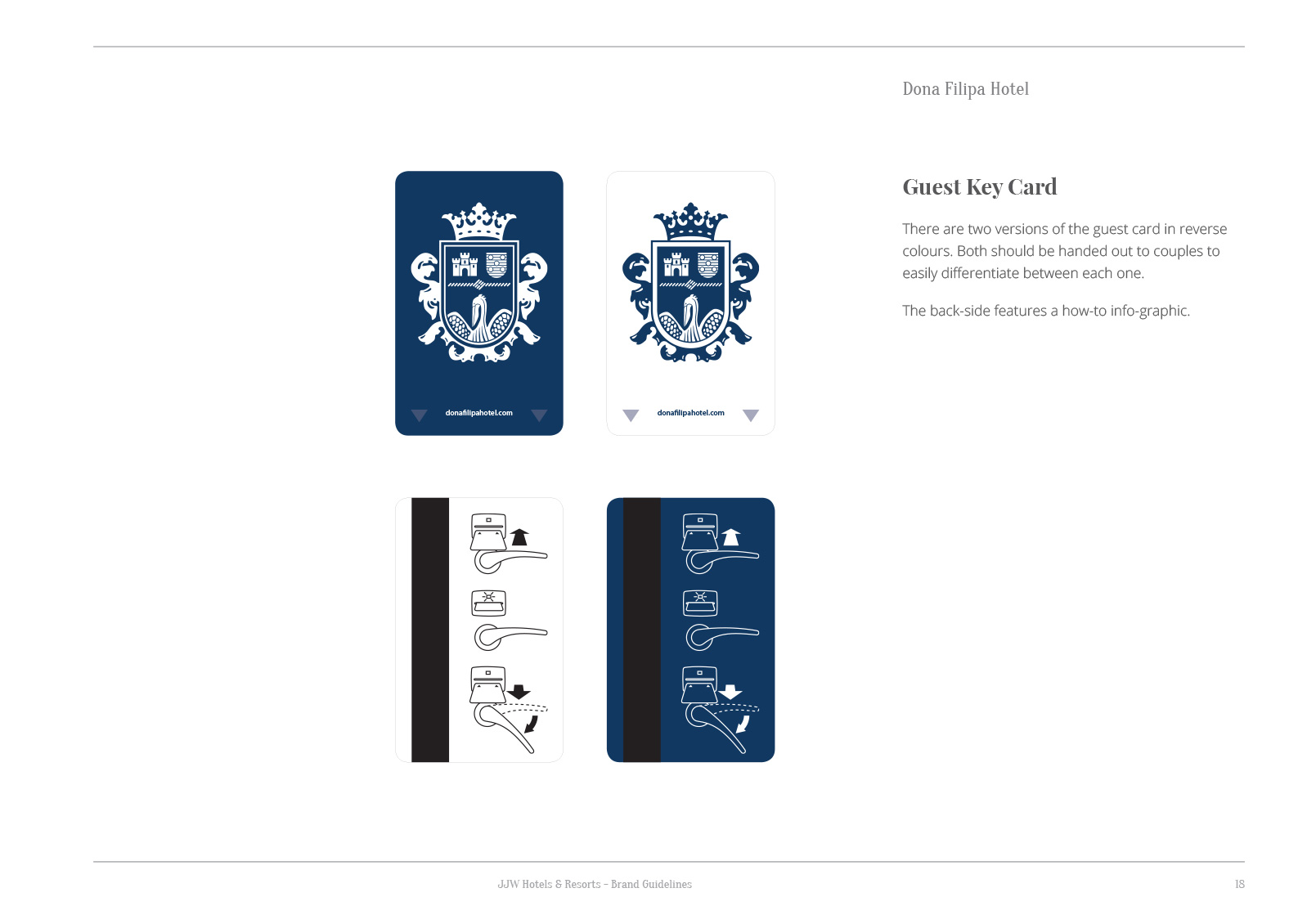
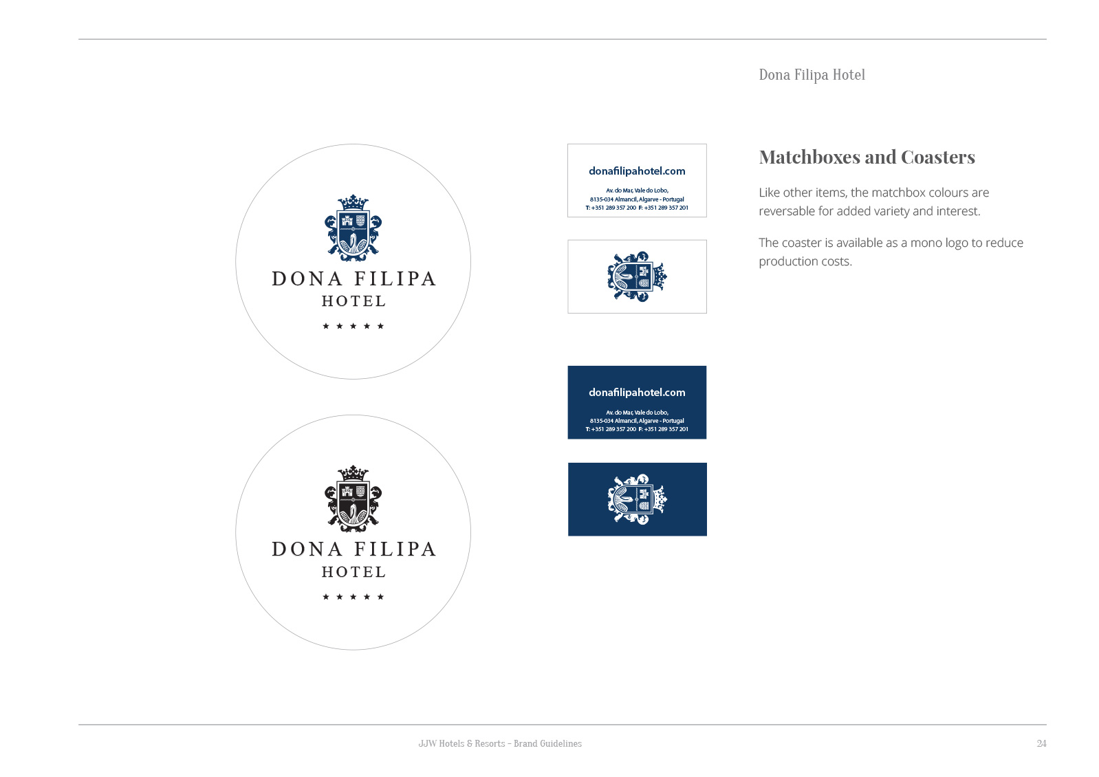
Rather than a simply inverse of the logo, I have created a reversed version where the elements of the shield retain their original appearance of white on blue; I felt this was particularly important for the pelican.
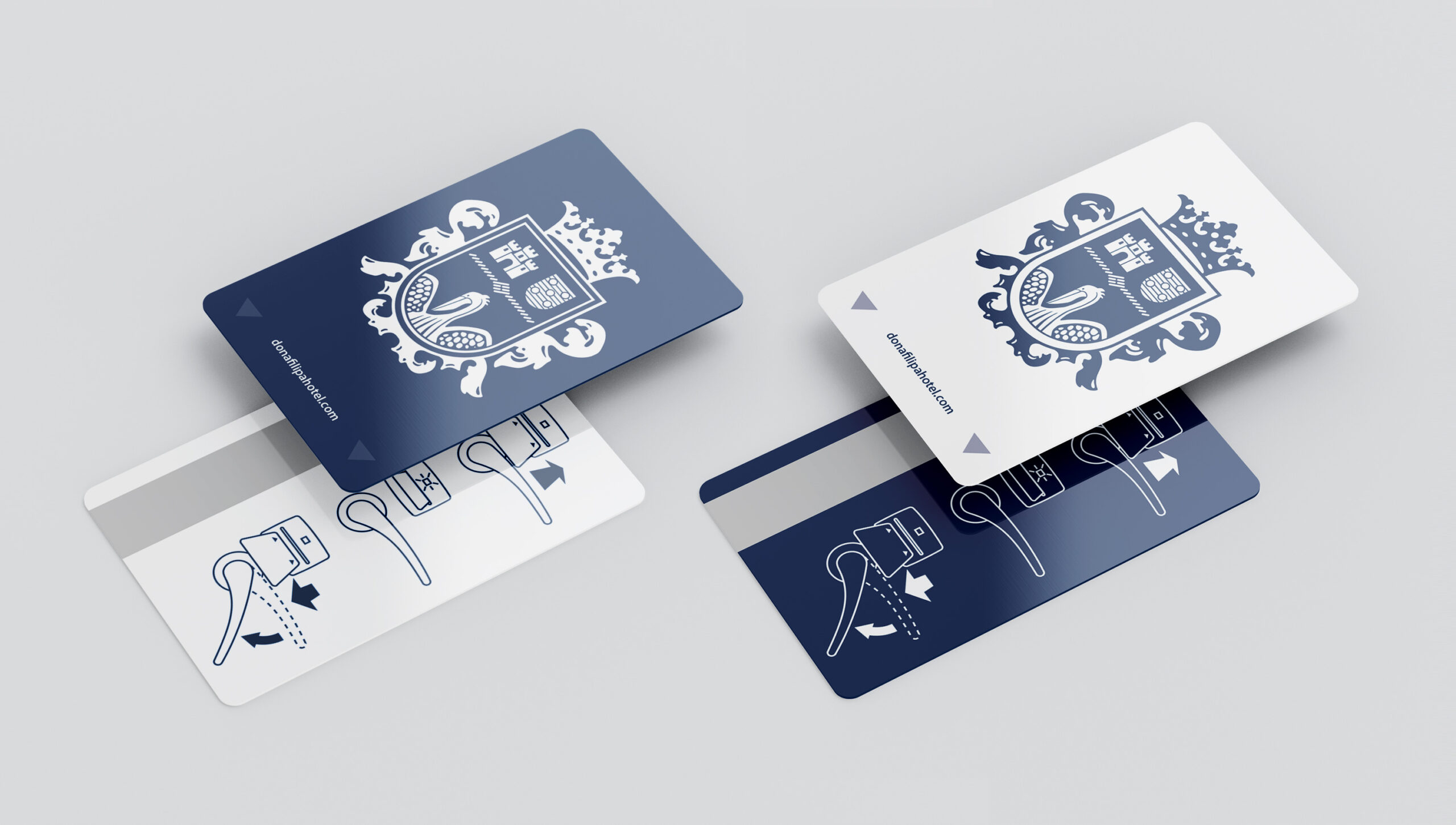
I developed two version of the guest key card; this makes it easier for couples to keep track of their own. Following some enquiries from guests, I created a simple info graphic to help explain the process of using the key card.
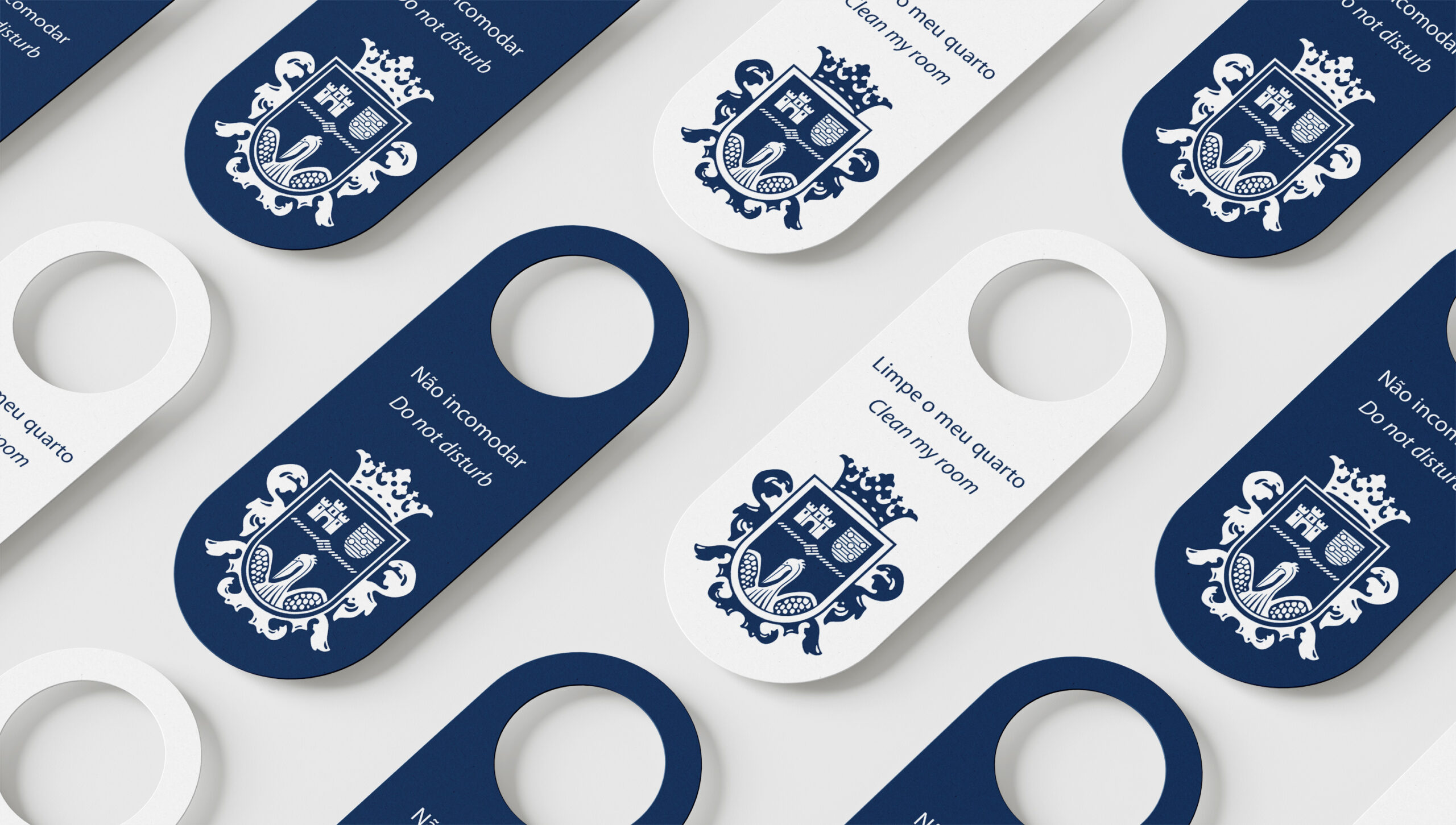
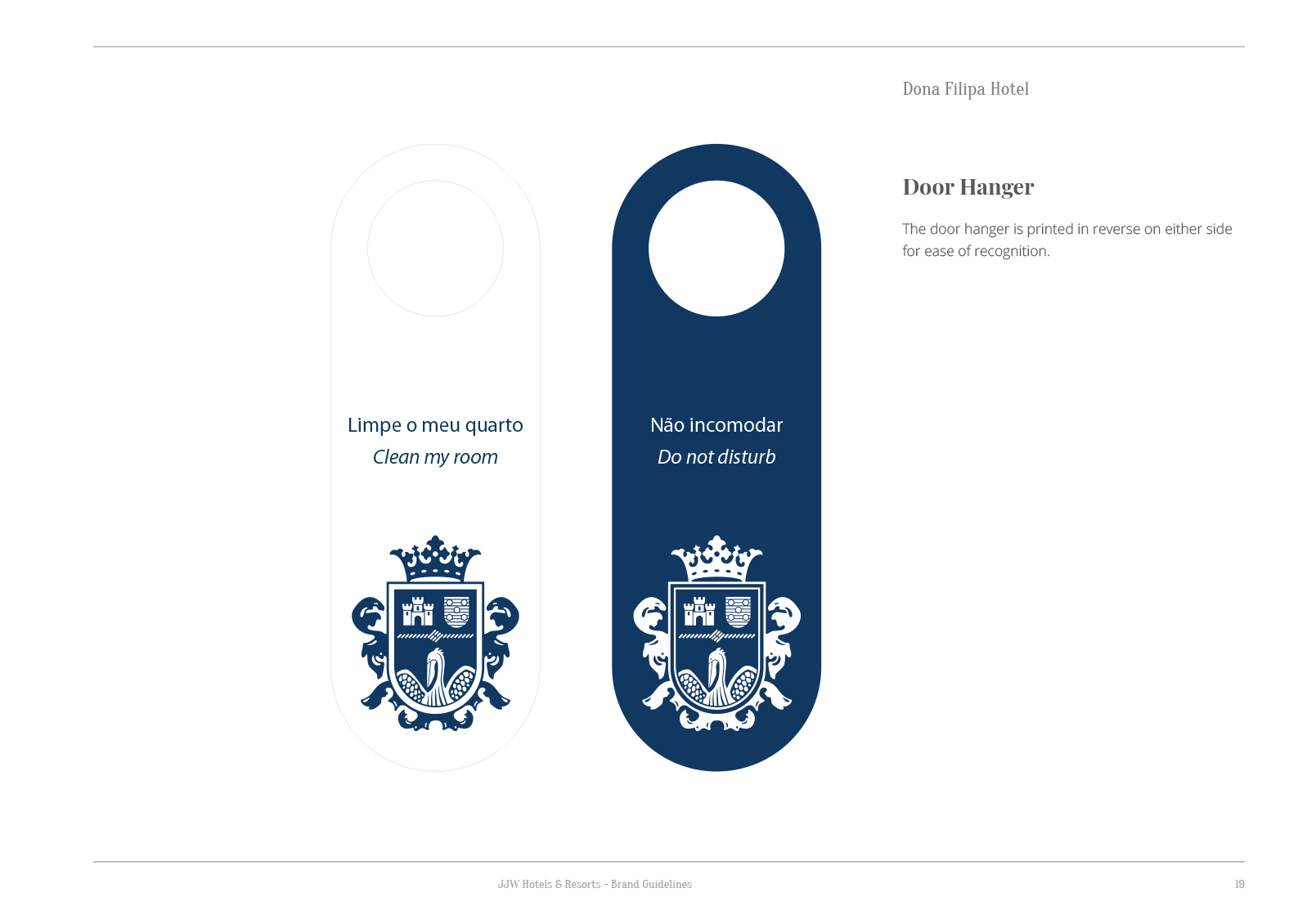
The brand is neatly applied to door hangers for guests and housekeeping staff to quickly understand the meaning of each side.
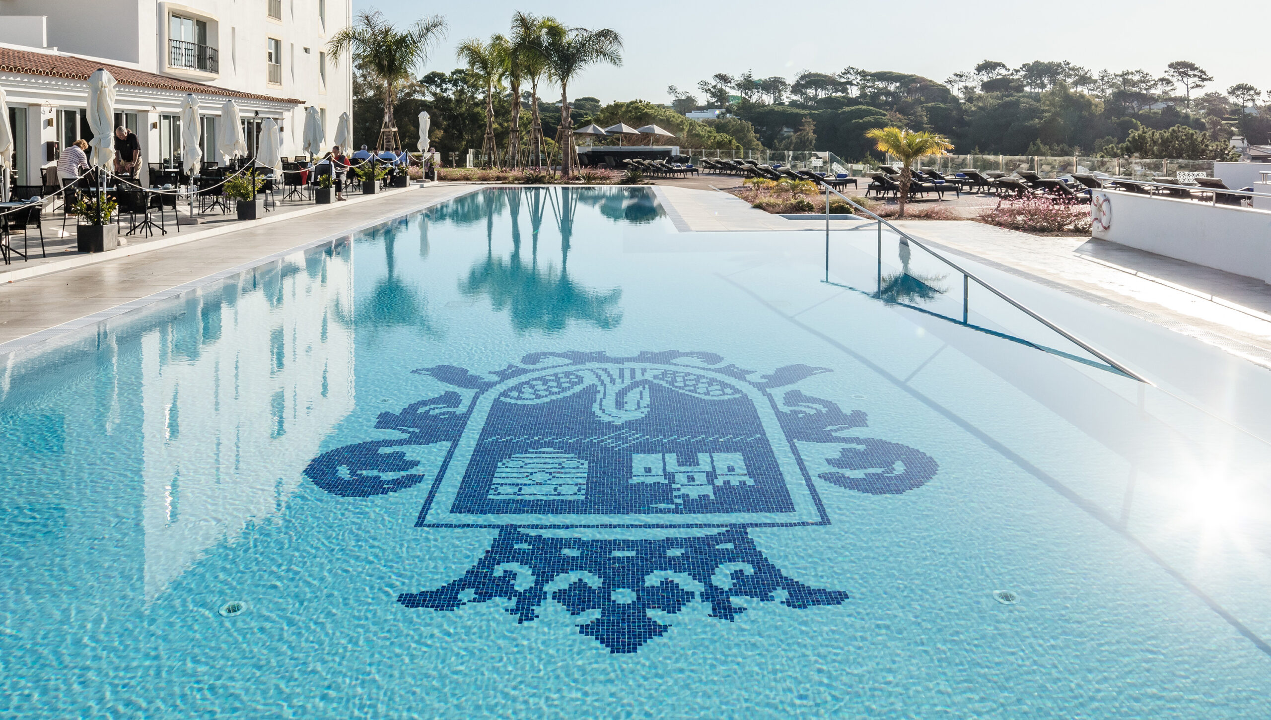
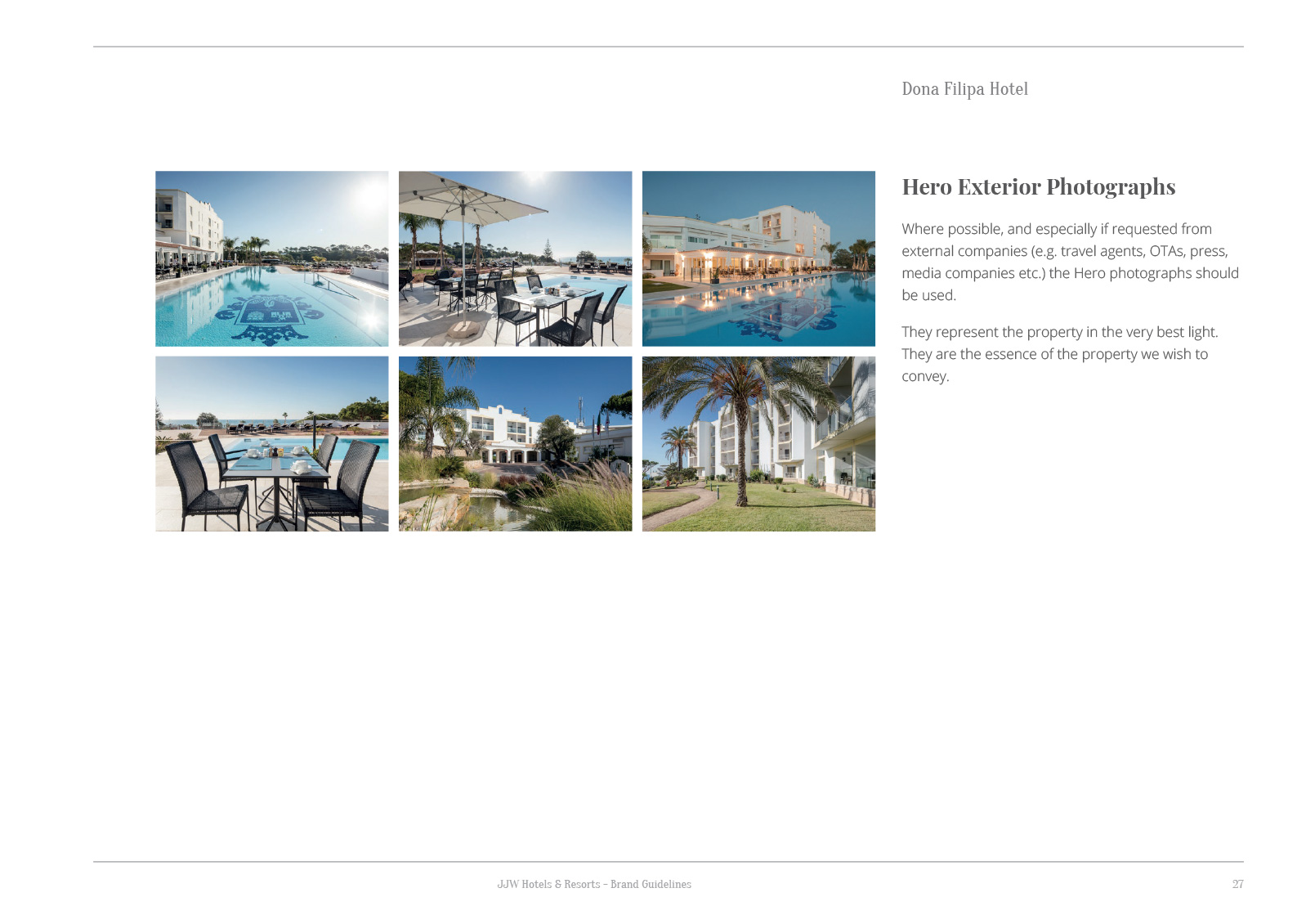
The crest was also transposed to a mosaic on the bottom of the hotel swimming pool.
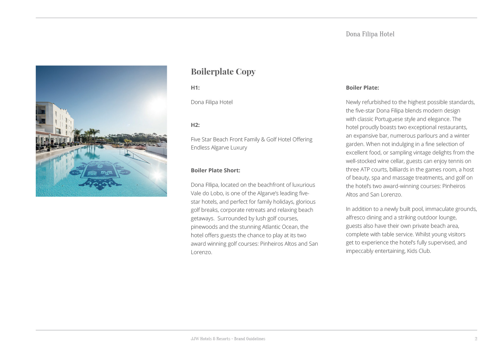
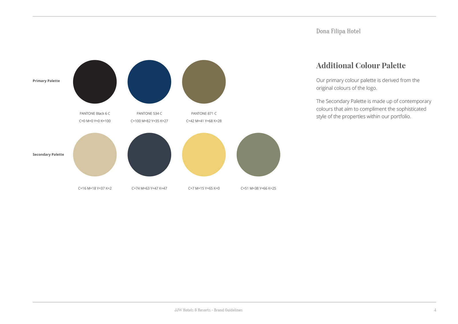
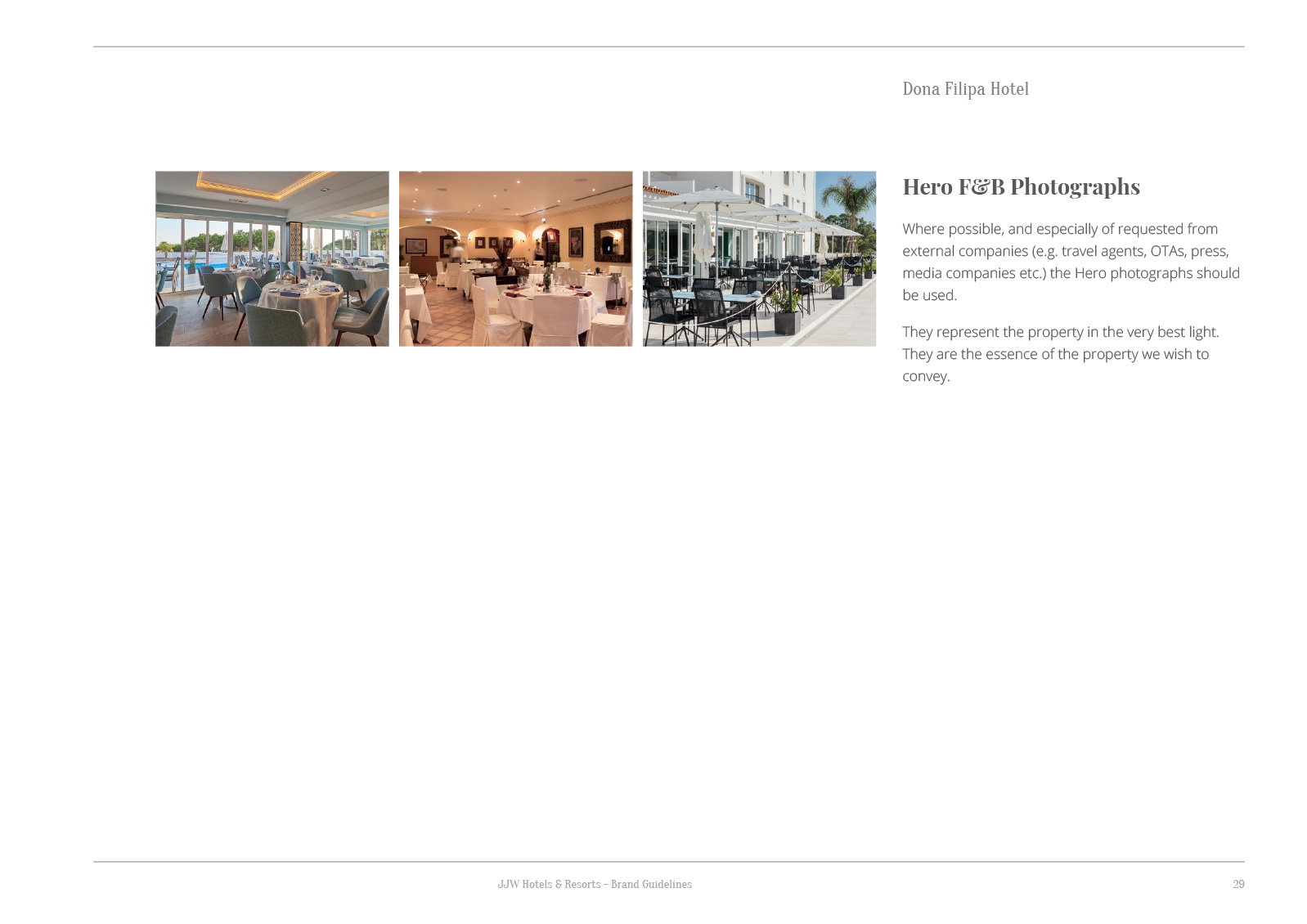
The full brand guidelines are shown here – click on the thumbnails and then scroll through the document.