![]() contact@david-edmonds.com | T: 07787 966091
contact@david-edmonds.com | T: 07787 966091
Bold brewing brand looks to disrupt with a splash of colour and some censorship of its own
Brand identity, brand system, graphic design, product packaging and campaign marketing for a brewery in the food & beverage and FMCG sectors.
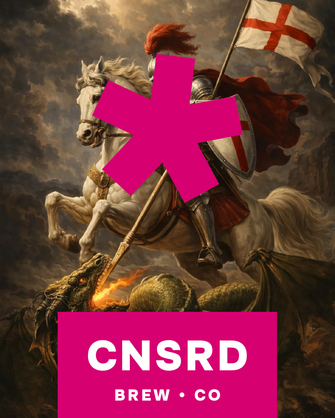
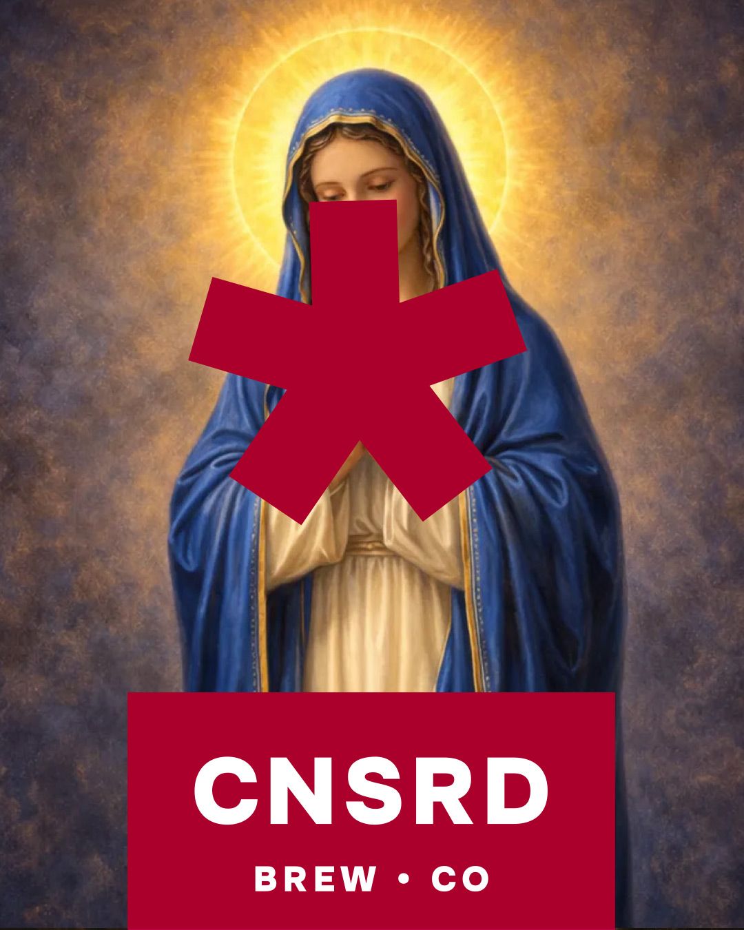
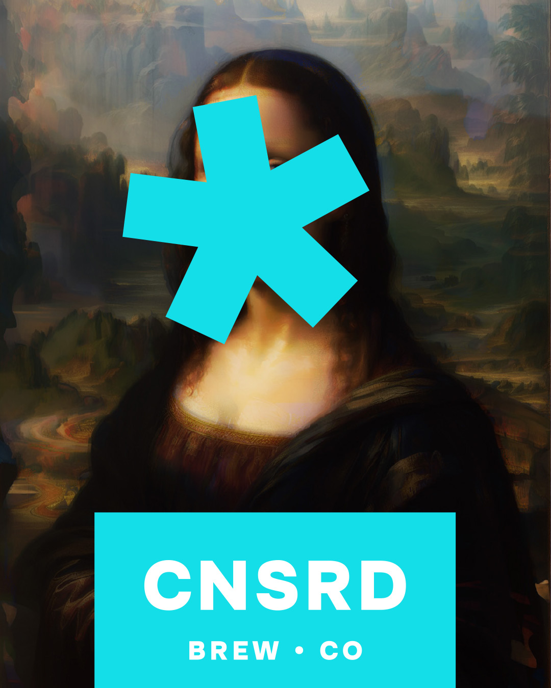
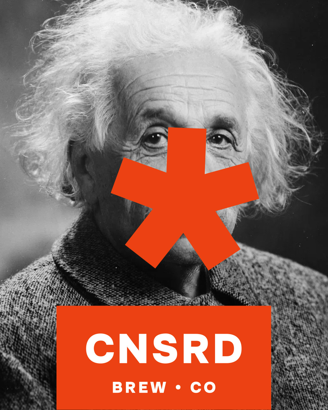
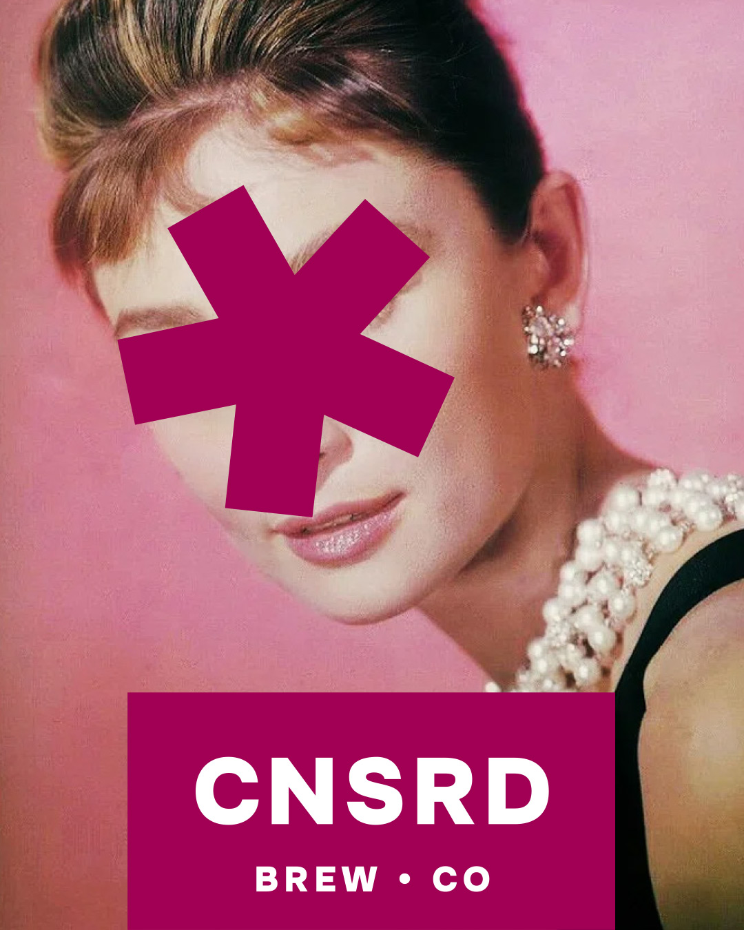
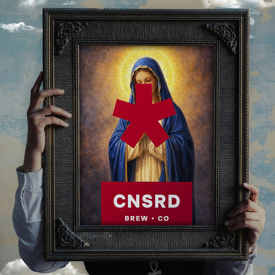
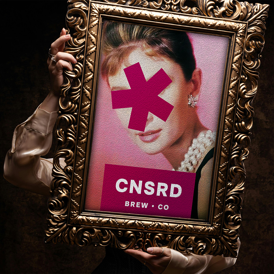
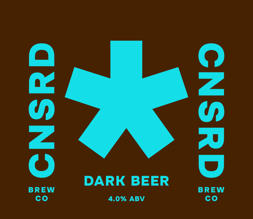
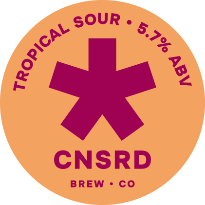
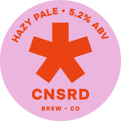
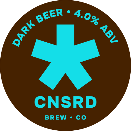
Imagine if a radical brewer was fed up with the increased censorship of products across the beer industry. Their reactionary response would be to hit back, to take ownership of the censorship, to stick two fingers up at the censors. Censored Brew Co. is that brand – censoring themselves and everything else they can get away with – hitting the market with a bright and bold, in-your-face approach to branding, packaging and marketing.
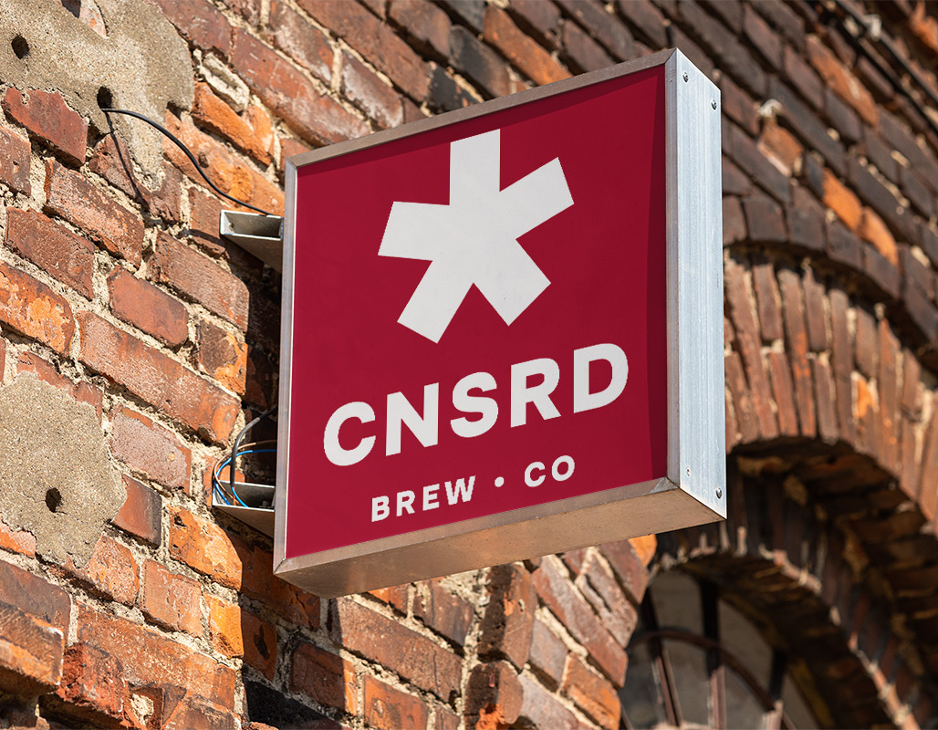
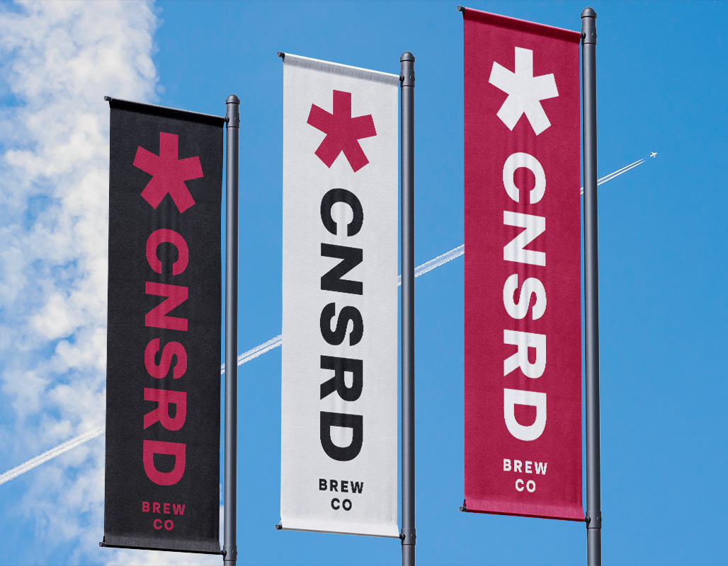
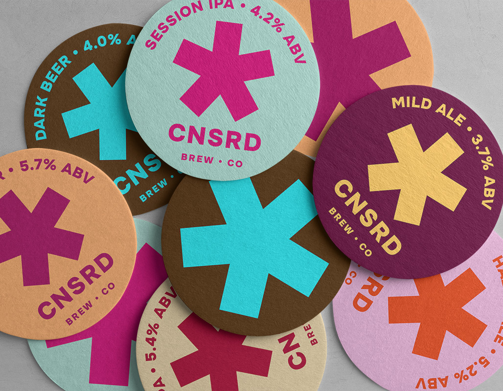
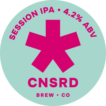
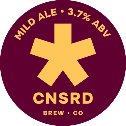
The censoring asterisk is implemented as a key element of the brand language; they censor their own packaging, logo and even their brand name. Campaign marketing is designed to provoke, the message is clear, and they don’t give a ****.

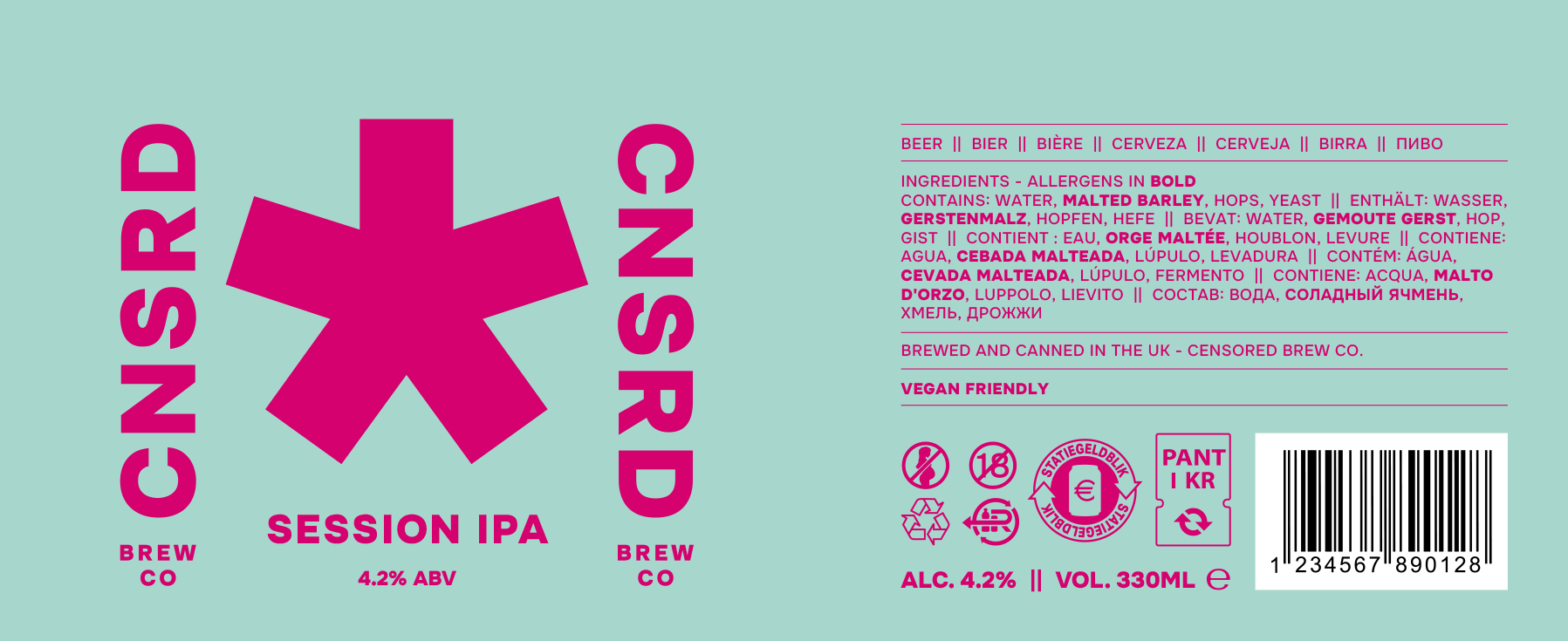
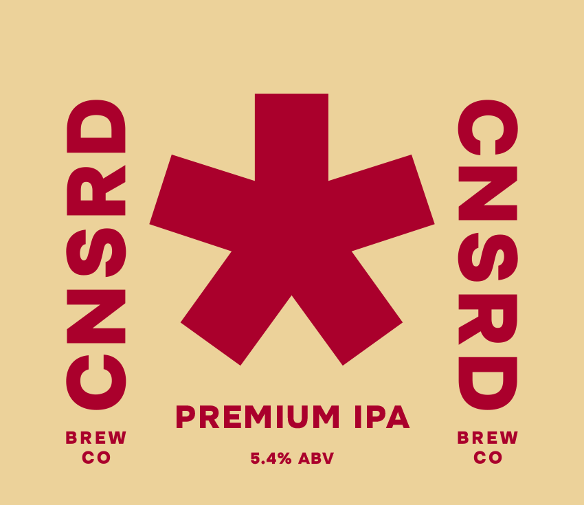
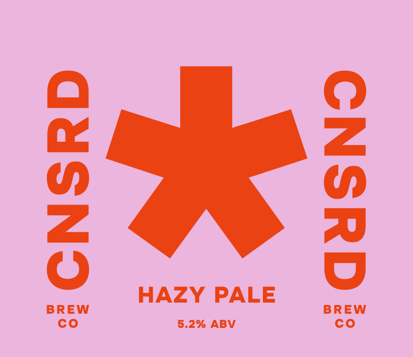
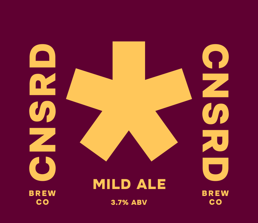
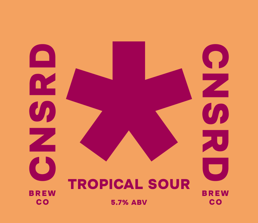
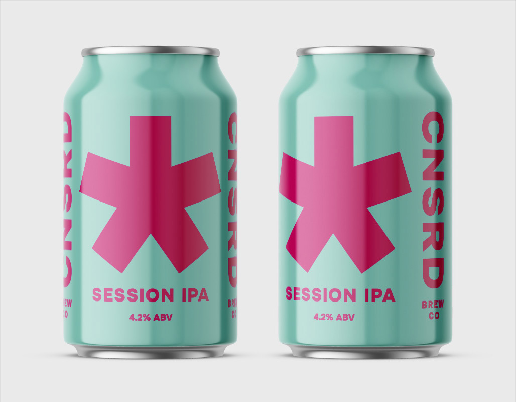
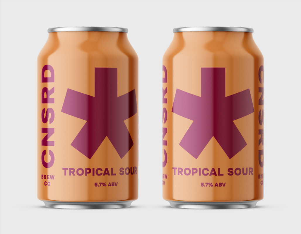
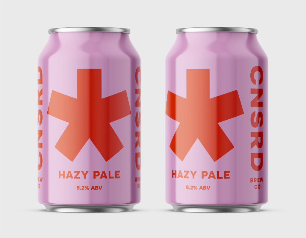
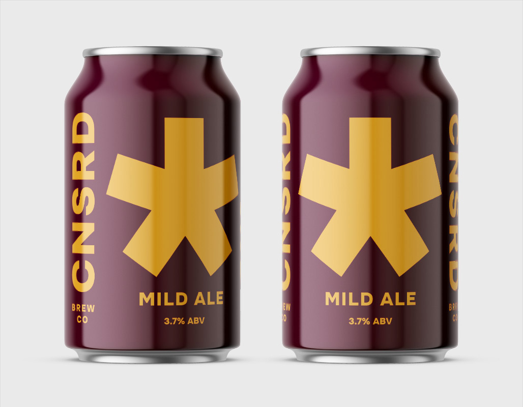
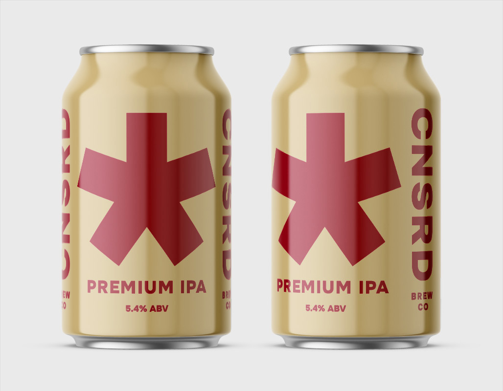
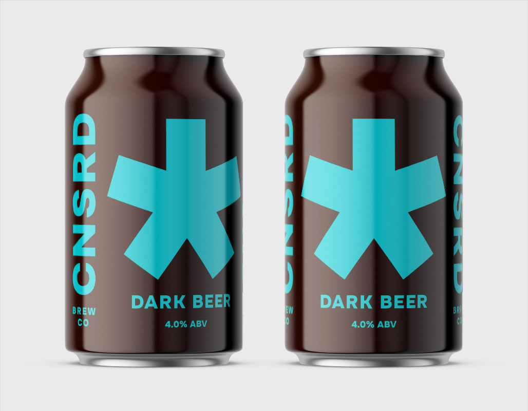
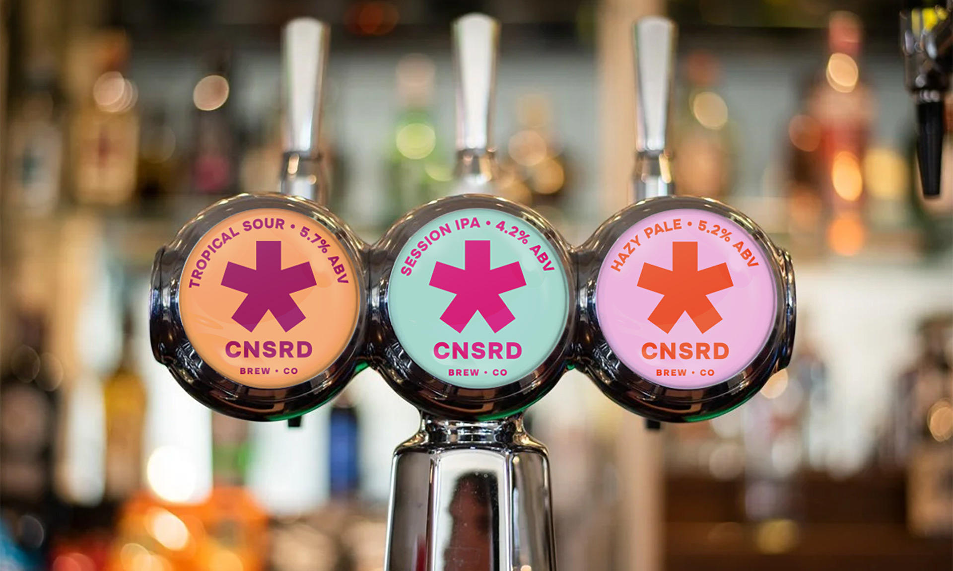
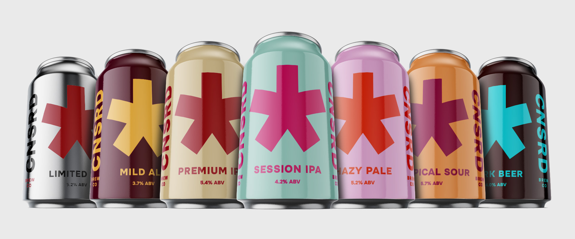
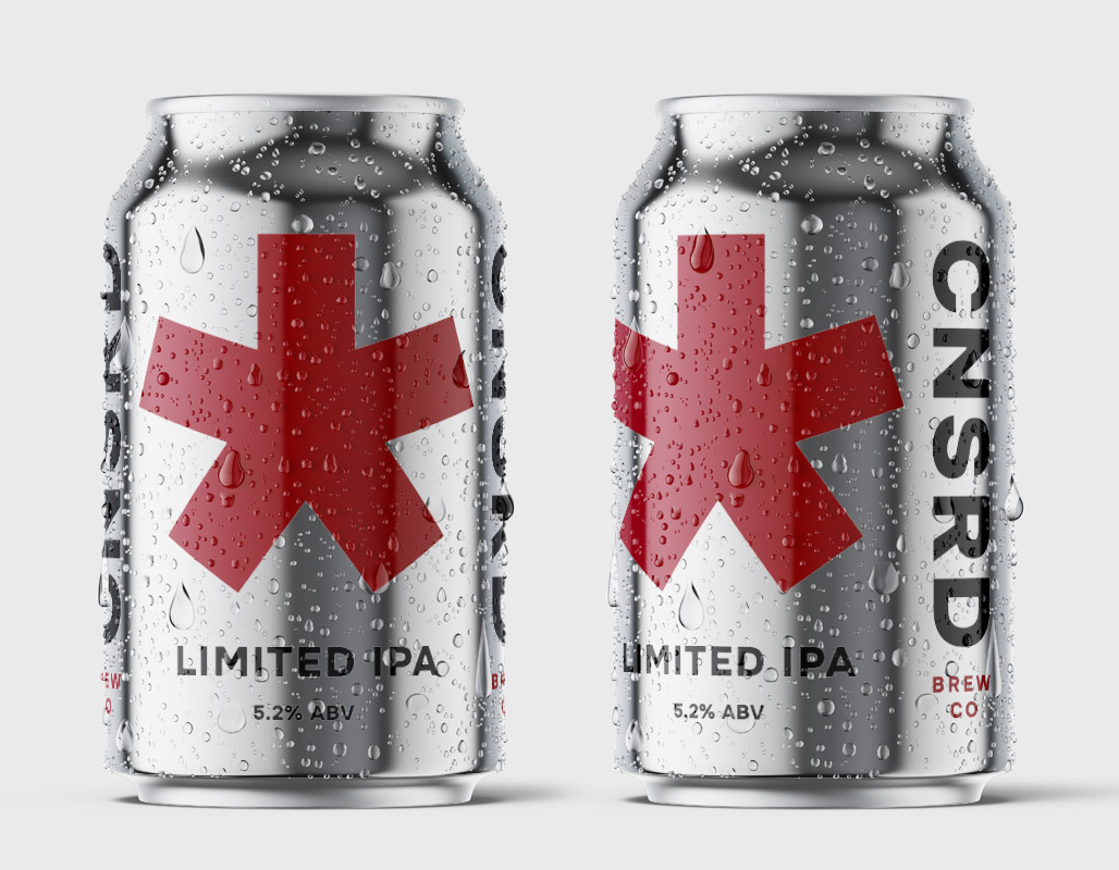
Six core product lines are all equally eye-catching, with bold contrasting colours that really pop from the shelves. There is room left for limited runs and special editions to follow this simple, but iconic brand system; just like the striking silver can of the Limited IPA shown below. This visual language is repeated across all customer touch points, be it beer mats, pump labels, promotional flags and signage. Such a memorable style really helps with brand discovery and recognition as the brand seeks to disrupt the craft beer market; elbows out.


Digital campaigns are designed to increase brand discovery and awareness; placed across targeted segments of Meta and Google, the campaigns are there to capture your attention. Censored Brew Co. is now on a mission of censorship of its own – censoring highly devisive subjects such as; Patriotic Symbolism, Religion, Art, Intellect and Beauty. Obviously, the subject matter shouldn’t be censored in this way – that’s kinda the point.