![]() contact@david-edmonds.com | T: 07787 966091
contact@david-edmonds.com | T: 07787 966091
A modern visual identity system built around community, conversation and coffee culture
The challenge
With decades of history behind it, Portobello Coffee House had built a loyal customer base and a strong local reputation. However, as coffee culture evolved, expectations around brand experience, digital engagement and visual identity changed dramatically.
The challenge was to retain the familiarity and character of a traditional coffee house while creating a more contemporary presence capable of connecting with today’s customers. The brand needed to feel warmer, brighter and more relevant without losing the authenticity that made it appealing in the first place.

The solution
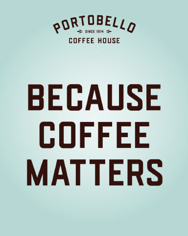
The project centred on developing a refreshed visual identity and brand language designed to bridge tradition and modern coffee culture.
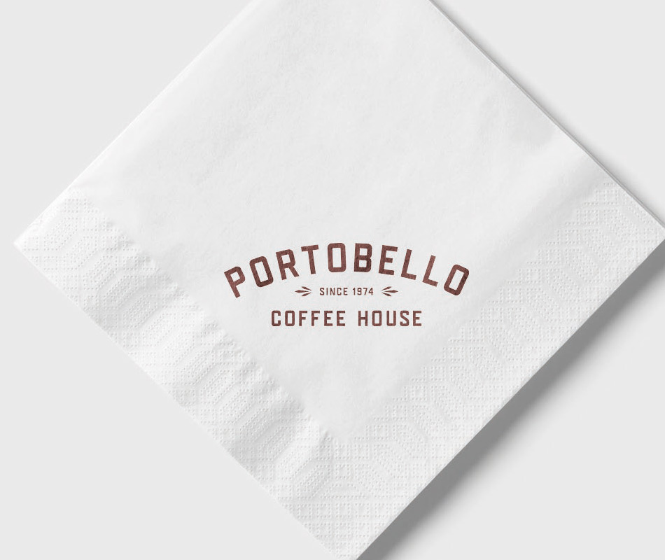
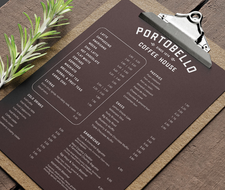
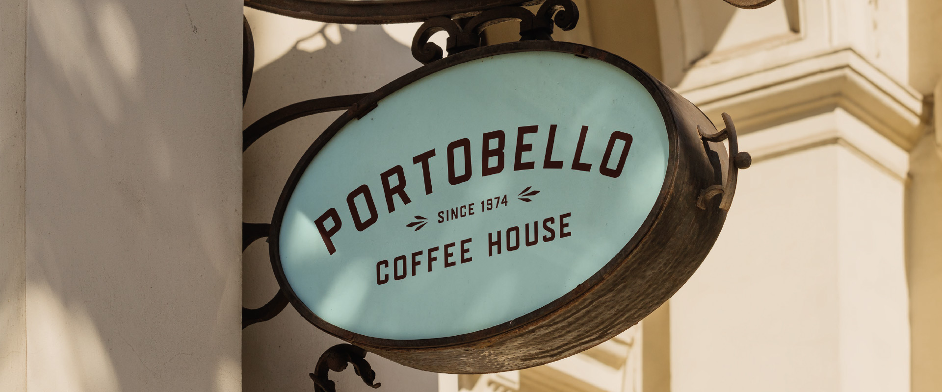
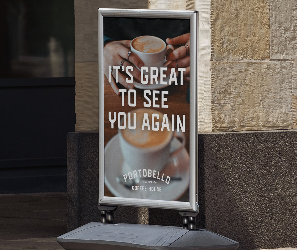
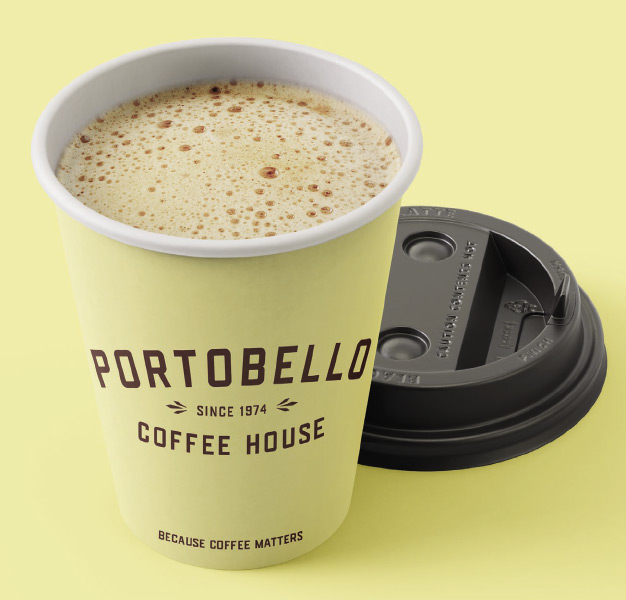
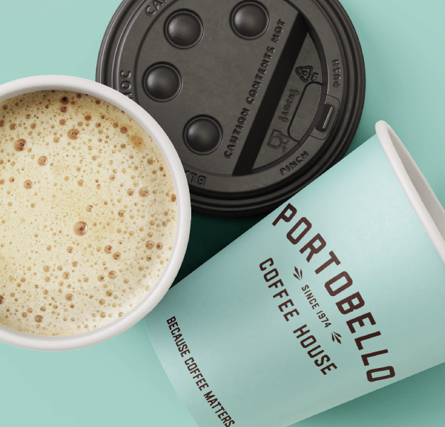
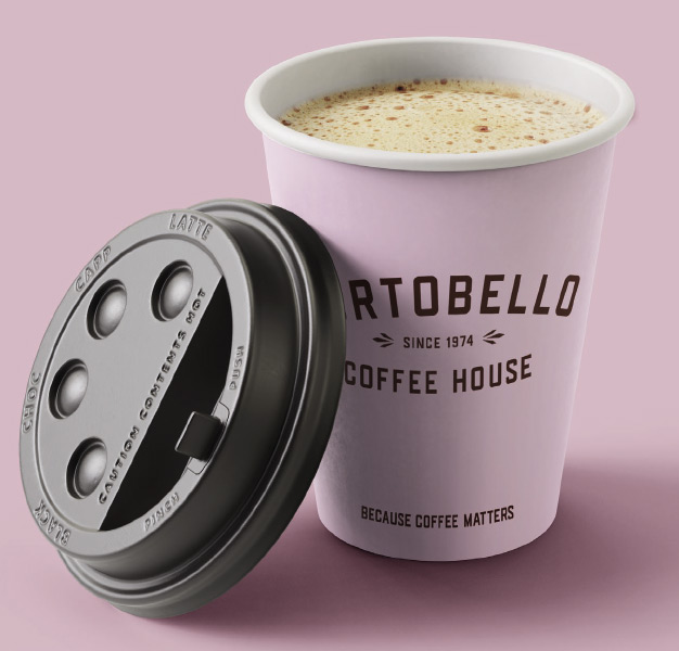
A refined logo, contemporary colour palette and expanded visual system provided the foundations for the new identity. Rich coffee-inspired tones were paired with brighter accent colours to create a more distinctive and engaging presence across physical and digital touchpoints. Conversational messaging and approachable language reinforced the social nature of the coffee house, helping the brand feel welcoming, familiar and human.
The resulting system was designed for flexibility, allowing products, promotions, events and everyday communications to work together as part of a cohesive brand experience.
The outcome
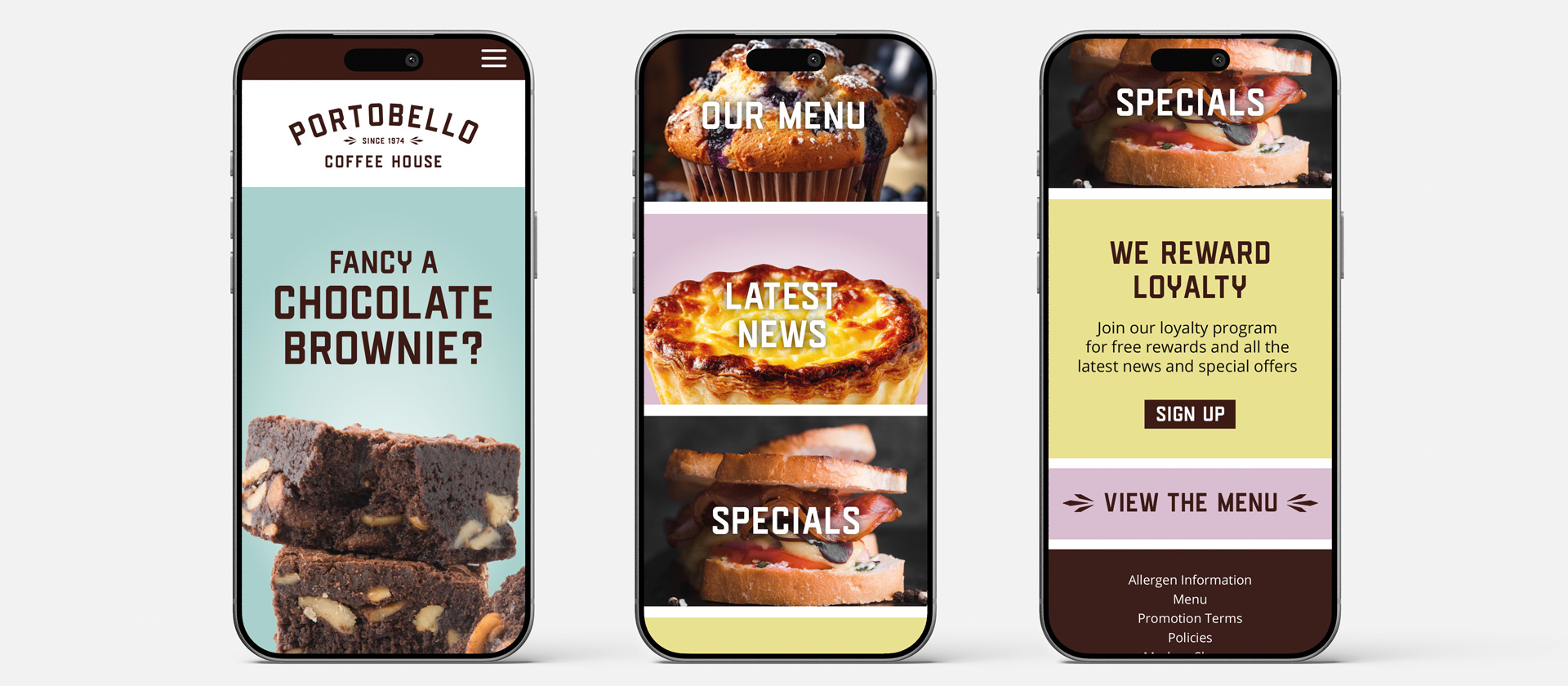
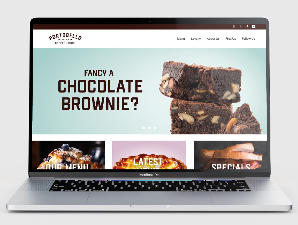
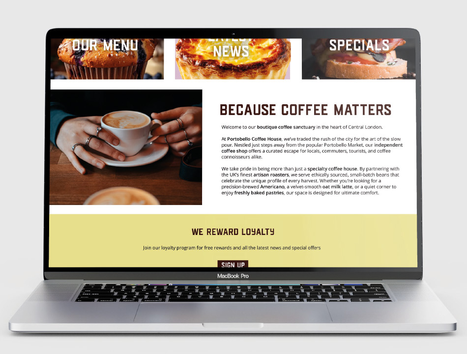
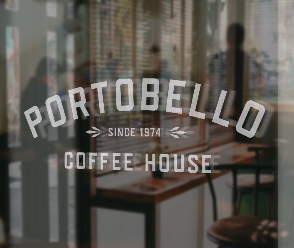
The identity is designed to work across a wide range of customer touchpoints, including takeaway packaging, menus, window graphics, signage, campaign advertising and digital communications.
A mobile-first website concept extends the brand online, balancing commercial objectives with ease of use. Product promotions, loyalty rewards and events are given equal prominence, creating a digital experience that reflects the social and community-focused nature of the brand.
Together, these elements demonstrate how a traditional coffee house can evolve for contemporary coffee culture while maintaining the familiarity, personality and sense of place that customers value most.